josefin of ransonerings-design believes in signs
WHY the name ransoneringsdesign?
Ransonering is a Swedish word that means “to ration”, which was a practice used during wartime, when people were only given the essentials. It relates to the project in that the signs only focus on the essentials, the information and the letters are sparse—it’s not made to be aesthetic, but practical.
How did the idea to document signs come about?
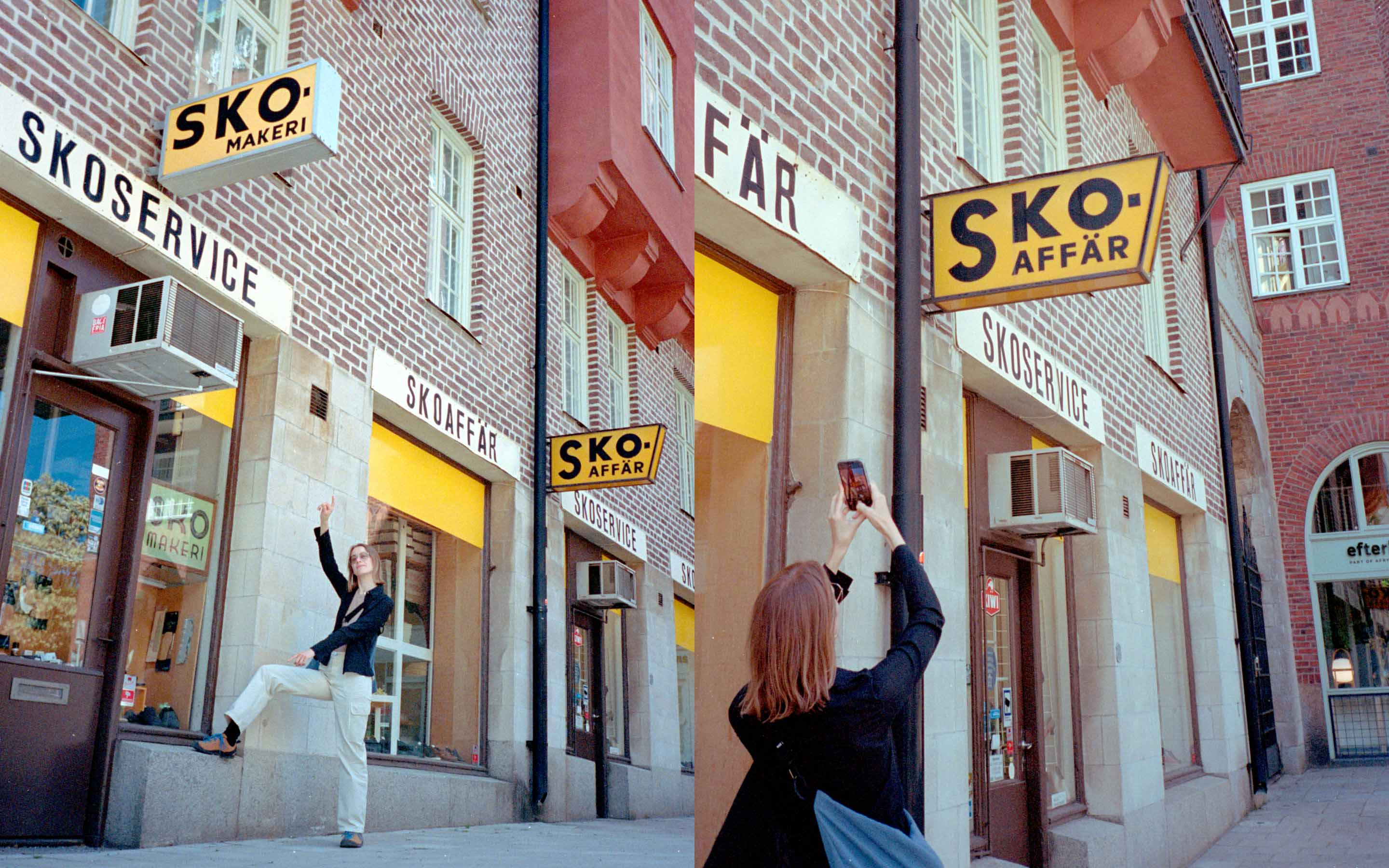
It started with my friend Agnes and I noticing style patterns in signage around the city, which we photographed and shared with each other. I like that it is non-design, not intended as design elements, but that someone has made choices more or less on purpose that turn it into accidental design. Signs that were originally practical, intended to inform, but have evolved to be more visual.
What’s a typical Swedish sign?
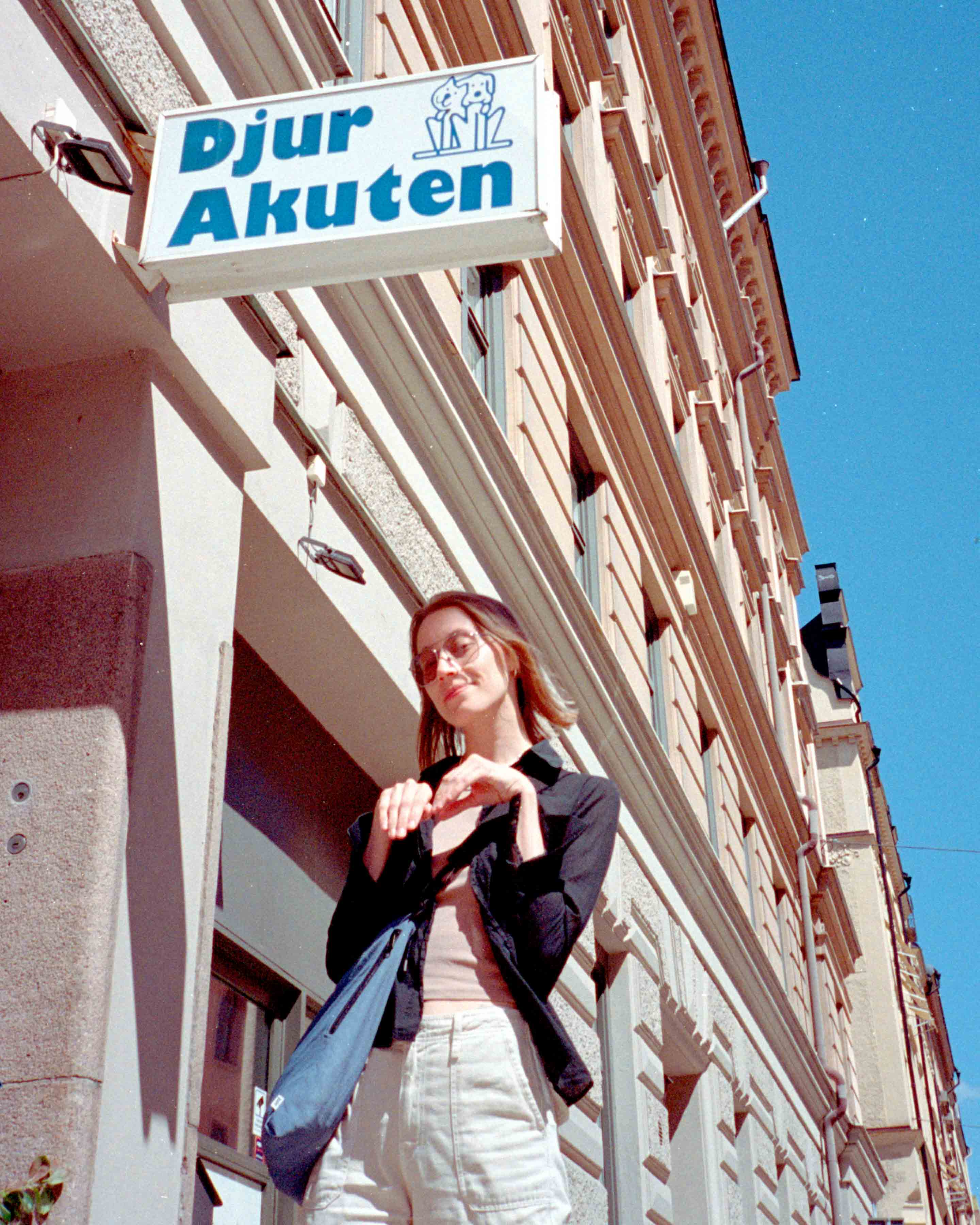
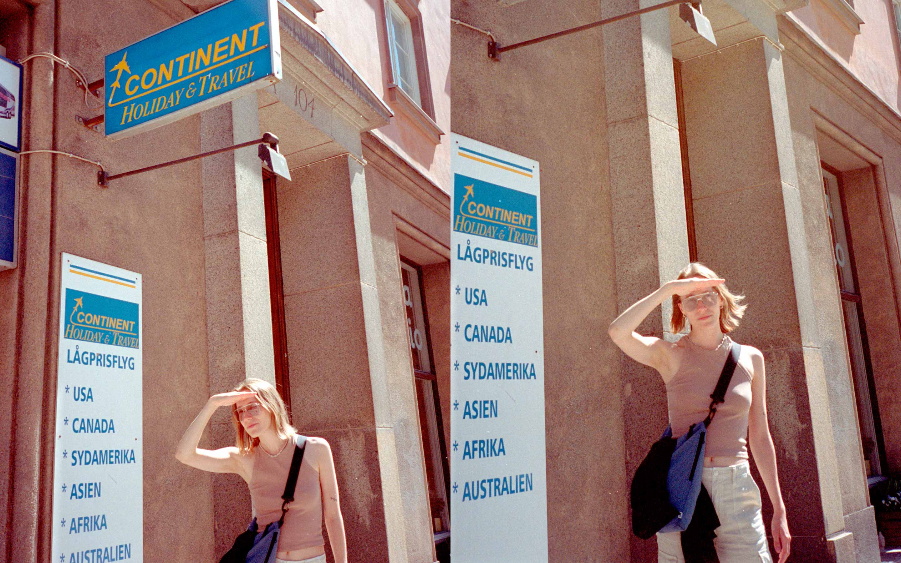
Abroad there is always often more information on the signs, while the Swedish signs are simple, clean and sparse in text.
the owner tried to fix it, but didn’t get the font right.
What makes a good sign in your opinion?
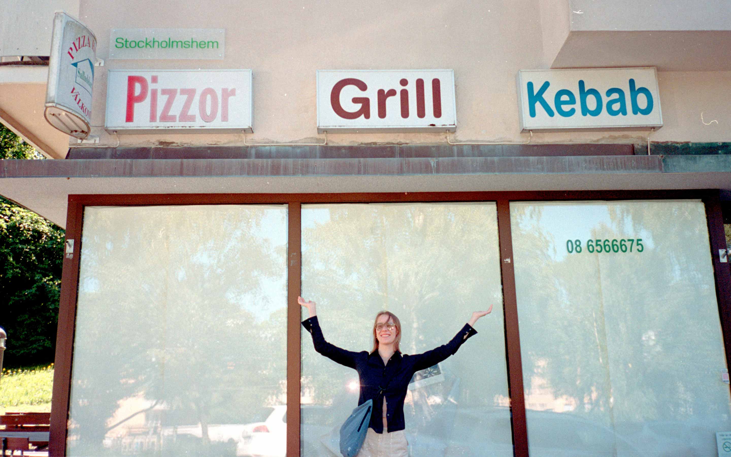
When we first started out I didn’t have a clear idea, but over time I have developed more of a sense of what I like, a feeling that it leaves me with. Personally not so sure about signs with illustrative elements in them, but that is not a good enough reason to exclude them. One of my favourite signs is a Pizza sign, where a part of the sign broke and the owner tried to mend it, but didn’t get the font right. It’s so charming and shouldn’t work, but it somehow does.
Does the sign make the place or the place make the sign?
The two definitely have to align! But I also like places that have kept the old signs hanging, even though the place has changed. ✺